Color is the first thing you notice – and the last thing you thought about when something doesn’t look right. Anyone who has ever chosen two yarns that are beautiful individually but somehow don’t work together knows what this means. It’s usually not bad taste. It’s because a few basic principles were unknown.
This article explains how colors interact – and how you find combinations you really want to wear. From the color wheel to the brightness test to practical yarn choice: here is everything you need.
The Color Wheel: The Most Important Foundation
The color wheel arranges colors in a circle – from red through orange, yellow, green, blue, violet back to red. All other colors are created by mixing: orange from red and yellow, violet from blue and red, and so on.
The position of a color on the color wheel determines how it interacts with other colors. From this arrangement, the most important color relationships can be derived:
Analogous Colors: Harmony through Proximity
Analogous colors are colors that lie directly next to each other on the color wheel. Blue, blue-green, and green. Or yellow, yellow-green, and green. Or red, red-orange, and orange.
Together, analogous colors create calm, harmonious combinations. There is no strong contrast, no tension – just a coherent, pleasant color image. For fading projects analogous colors are ideal: they blend seamlessly into each other without the transition appearing abrupt.
If you’re unsure how colors go together: Two analogous colors from the same yarn palette always work well together.
Complementary Colors: Contrast through Opposition
Complementary colors are directly opposite each other on the color wheel. Blue and Orange. Red and Green. Yellow and Violet.
These combinations are lively and contrasting – complementary colors enhance each other, each color appears more intense next to its complementary color. That’s why a blue sweater with an orange edge pattern immediately catches the eye.
But: Complementary colors placed in large areas next to each other can quickly become overwhelming. The safe use is as a main color and an accent color – not as two equally large blocks. A deep dark navy with a small orange accent pattern: elegant. Two equally large areas in blue and orange: challenging.
Triadic Colors: Vibrancy through Triads
Three colors evenly spaced on the color wheel: Red, Yellow, and Blue. Or Orange, Green, and Violet.
Triadic combinations are very lively and have a playful character. For knitting projects, they require careful planning, especially regarding brightness and saturation. If all three colors are equally saturated and equally bright, the result can look restless. Better: one color as the dominant main color, the others as subordinate accents.
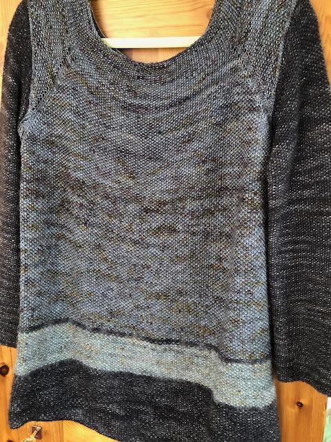
Monochromatic: Elegance through unity
Different brightness and saturation of the same color. Light blue, medium blue, dark blue. Or light beige, sand, camel.
Monochromatic combinations almost always look elegant and timeless. There is no color contrast – the contrast is created solely by brightness. This makes them a safe starting point for anyone still unsure about Color Combinations.
A classic example: a Sweater in KFO Heavy Merino Pale Blush with cuffs and collar in KFO Merino Dusty Rose – two tones of the same pink, different brightness, instantly harmonious.
Brightness (Value): The underestimated design element
Besides the color itself, brightness – called “Value” in English – is the most important design element. Brightness describes how light or dark a color is, regardless of its shade.
Two colors with similar brightness sometimes don’t work together, even if their shade would match – because they differ too little. The result looks dull and flat. Two colors with a strong brightness difference almost always work.
The black-and-white test: Photograph your yarn selection and convert the photo to black and white. Do you still see a clear difference between the colors? Then the combination works. If both colors look almost identical in the black-and-white photo, the brightness contrast is missing.
This is especially important for colorwork and Stranded Colorwork: The pattern is created solely by the contrast between the pattern color and the background color. If both colors are similarly bright, the pattern disappears. As a rule of thumb: a brightness difference of at least 30–40% between the pattern color and the background is necessary for the pattern to be clearly visible.
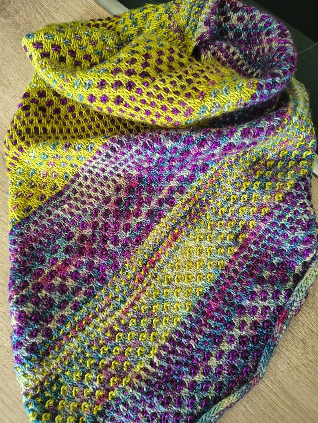
Saturation: How bright are the colors?
Saturation describes how intense or muted a color is. A bright cobalt blue is highly saturated. A dusty blue that looks almost gray is low in saturation.
Highly saturated colors attract attention – they are ideal as accent colors or for highlights in a pattern. In large areas, they can be tiring or appear dominant.
Low-saturation colors – muted, subdued, natural tones – wear very comfortably in large areas. They give a project calmness and make the saturated accents appear even more vivid.
The classic success formula: muted main color + saturated accent color. A warm camel as the main color, a small cornflower blue as an accent edge or pattern element – that is almost always a good choice.
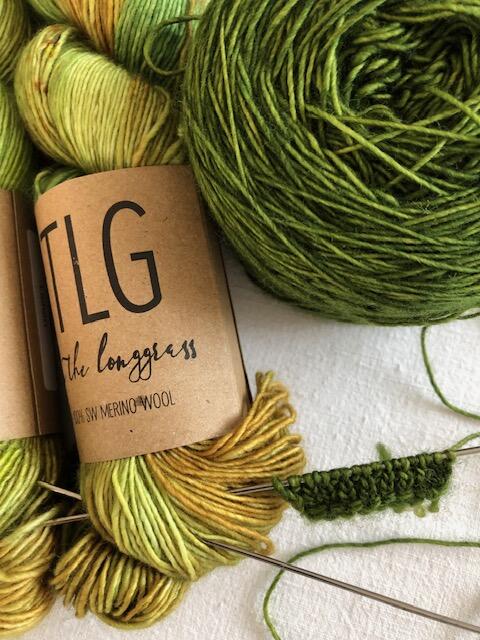
KFO Merino offers both: subdued, muted tones (dusty pink, Warm Grey, sage, linen) and vivid, saturated colors (tomato red, cobalt, forest green). The palette is arranged so that muted and saturated colors from the same Collection can be combined effortlessly.
Warm tones and cool tones: Color temperature
Colors have a temperature: Red, orange, yellow, and their mixtures are warm. Blue, green, violet, and their mixtures are cool. This temperature influences how colors appear side by side.
Warm and cool tones together create tension and liveliness. A warm terracotta next to a cool dusty blue – classic, elegant, and lively at the same time. This combination has a quality that purely warm or purely cool combinations do not achieve.
Purely warm or purely cool combinations appear more harmonious and coherent. A bundle of earth tones – camel, beige, light brown, rust – always looks good together because all the shades share the same color temperature.
An important detail: Within each color, there are warm and cool variants. A red can be orange-warm (tomato red) or blue-cool (cherry red). A yellow can be green-cool or orange-warm. When combining two colors, make sure their color temperatures are compatible: Two warm tones together look more harmonious than a warm and a cool tone of the same color.
Texture and Sheen as color enhancers
Color interacts not only with other colors but also with the surface of the yarn. The same shade looks different in a matte Merino than in a shiny silk blend yarn.
Matte Merino (KFO Merino, KFO Heavy Merino): Colors appear muted, natural, deep. The shades do not emit brightness but absorb light.
Silk blend yarns (Manos del Uruguay Fino, Fyberspates Cumulus): Colors appear brighter and more vivid because the silk reflects light.
Mohair Halo (KFO Soft Silk Mohair): The halo softens color edges and creates a dreamy, diffuse color character. Strong colors become softer and more romantic through the halo.
This can be used as a design tool: Two yarns in a similar shade but different texture – for example a DK Merino and a Mohair in the same color – create an interesting layering without needing a color change.
For colorwork and Stranded Colorwork: specific rules
For colorwork patterns – Norweger, Fair Isle, geometric motifs – some specific requirements apply:
Brightness contrast is a must: The pattern is only visible if the pattern color and background color have enough brightness difference. Do the black and white test.
Match saturation: Two colors with very different saturation can dominate each other. If the pattern color is much more saturated than the background, the pattern pops out. If the background is more saturated, the pattern recedes. The desired effect influences the yarn choice.
Natural colors as a safe bet: A natural white or natural gray background with a single accent color is the classic colorwork recipe – always effective, always clear. Rauma Finull in natural white and dark blue, or Léttlopi in gray and rust: such combinations have decades of tradition and work for good reason.
Practical steps for color selection
Lay balls together and photograph: Place the balls side by side on a neutral background and photograph them. The photo shows the pure color relationship without the distraction of spatial impression.
Black and white test: Convert photo to grayscale. Is the difference still visible? Contrast is sufficient.
Warmth check: Are your colors all warm, all cool, or mixed? Consistent color temperature improves harmony.
Sample yarn test: Knit a small swatch with all colors before starting the project. On the needle and in the finished knit, a combination can look different than in ball form.
Our Color Combination Service: If you're unsure, write to us. We help develop a color combination from your idea or mood that really works.
Read more: